.png)
Much has been said and written regarding the proliferation of “pencil towers” in Manhattan, in the area south of Central Park. Shapes of buildings - tall and skinny, flat and long, and everything in between - have always been a part of the city. But the beginnings of pencil-thin towers are new to New York. There have been critical pieces in popular news sources as well, such as this article in the Guardian.

Treehuger.com describes the "pencil towers" as "There is really not much good that can be said about these buildings other than admiring the engineering. The carbon burden is incredibly high; as rich as they are, the owners contribute little to the city; the buildings are terrible at ground level because it is all loading and parking lobby; many complain that in New York, their shadows are ruining Central Park. They are a thumb in the eye of everyone else in the city." A lot of this is not much architectural criticism, but criticism or the super-rich buying multimillion dollar units and never occupying them; a place to park their money.
There is a diagram prepared by the architectural firm KPF showing what could become of Midtown if all the potential sites for 600-foot-tall pencil towers were developed. There are 159 of them. To accomplish this, a developer would purchase the air rights of neighboring sites and stack those rights vertically to achieve the desired height. A diagram can be seen in a Guardian article.
The collective criticism is that this is new, terrible, and only for the rich. There was, however, similar iconography as far back as the 13th century, so of course it is not new. Historically, a well-known example of the lives of the rich and famous is the 72 stone pencil towers in the Italian hill town of San Gimignano. Fourteen remain and can be seen below:

Back to shapes. Cities have always had various geometries; to think that the shapes must trace each other’s geometry, however, is not an interesting or rich way to put the pieces together. Conversely, it can succeed, as in the second example below.
Each of the following two regularly spaced diagrams is rather boring compared to the variety shown in the diagram under the blog title above, but this is how much zoning is based. Each building geometry by itself can be handled successfully within those rules, as in the second example below, showing the row houses in the Presidio.
LONG AND LOW for instance:

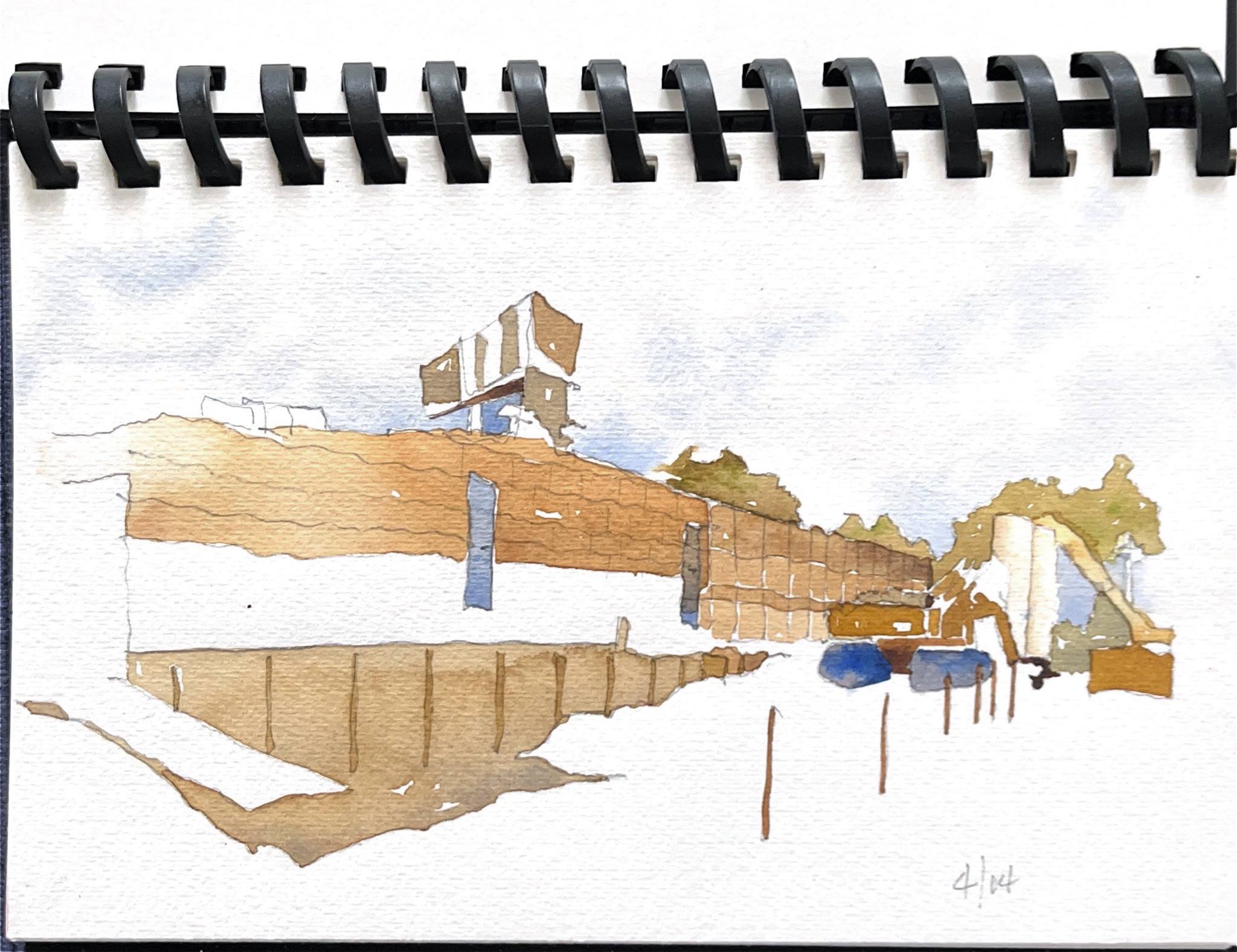
This example of single long and low is the DeYoung Museum in Golden Gate Park (under construction illustration below):
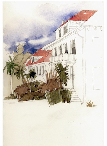
Regular shapes lined up in a row (diagram below) can be successful and striking when articulated in a more interesting manner, like the rows of houses in the San Francisco Presidio:
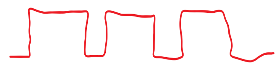
Other ways of massing these shapes is grouping them (below) and creating likeness diagrams as to size, shape, position, and interval:

Most cities though have organically evolved into a variety of cityscapes, with an occasional tower here and there or even grouped together for emphasis. As mentioned above, size, shape, attitude, interval, and direction of the geometry is always the most interesting part. As a result, these shapes can create spatial overlay and procession, both literal and perceptual.
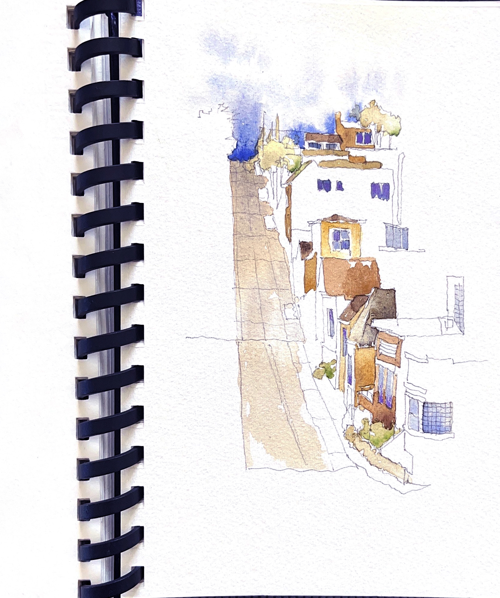
Variety can be seen in the topography as well, like the Davis Street hill in San Francisco:
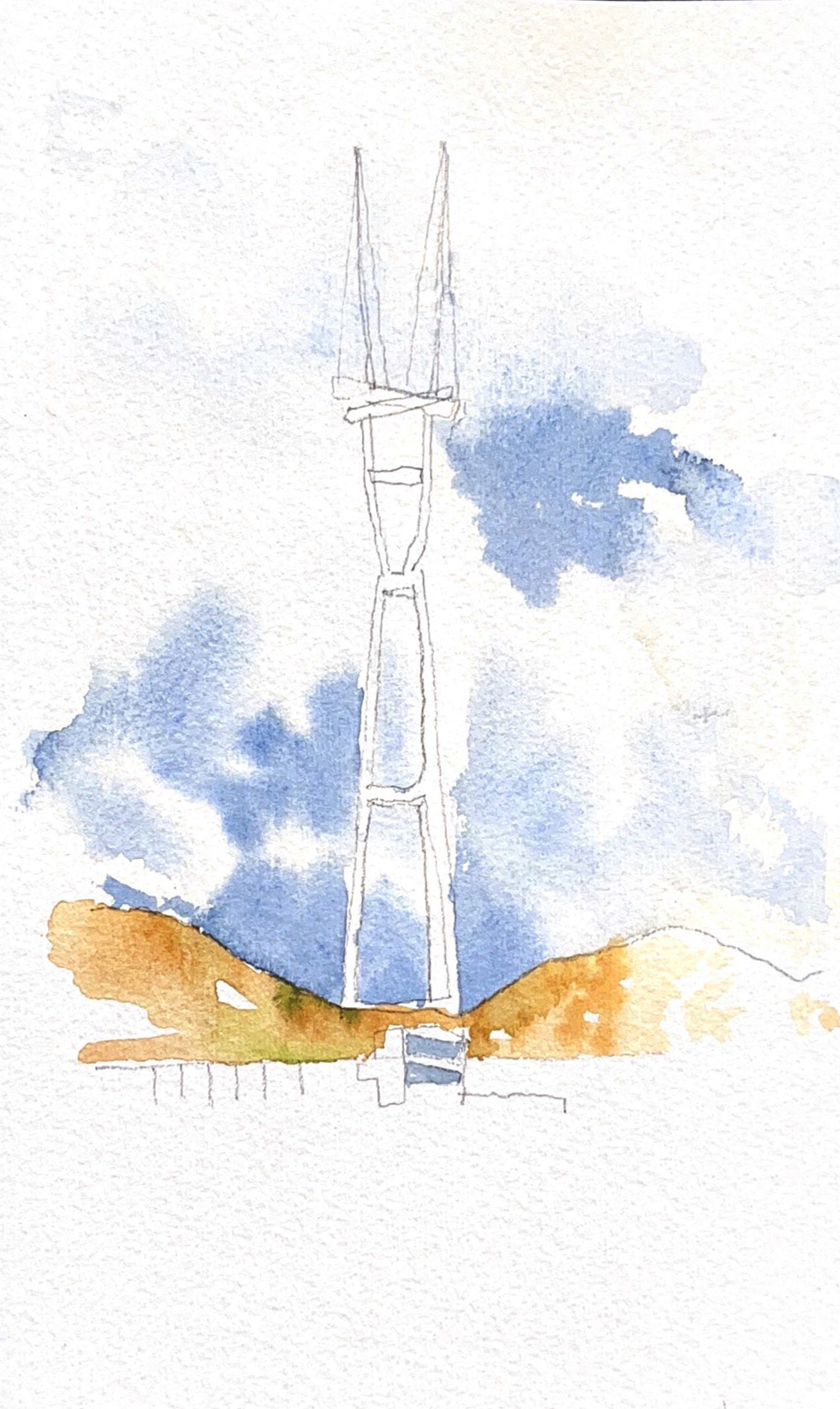
Towers get placed for emphasis, whether intentionally or not. The Eiffel Tower, with its emphatic shape, dominates the Paris skyline. San Francisco, too, has a tower: the Sutro Tower (below), which, even though maligned, is still a dominant feature on the city skyline. It makes a contrasting statement to the Transamerica Pyramid, the more famous tower seen in the watercolor on the right below, but buried among all the other downtown tall buildings. The Golden Gate Bridge towers stand alone (image later).
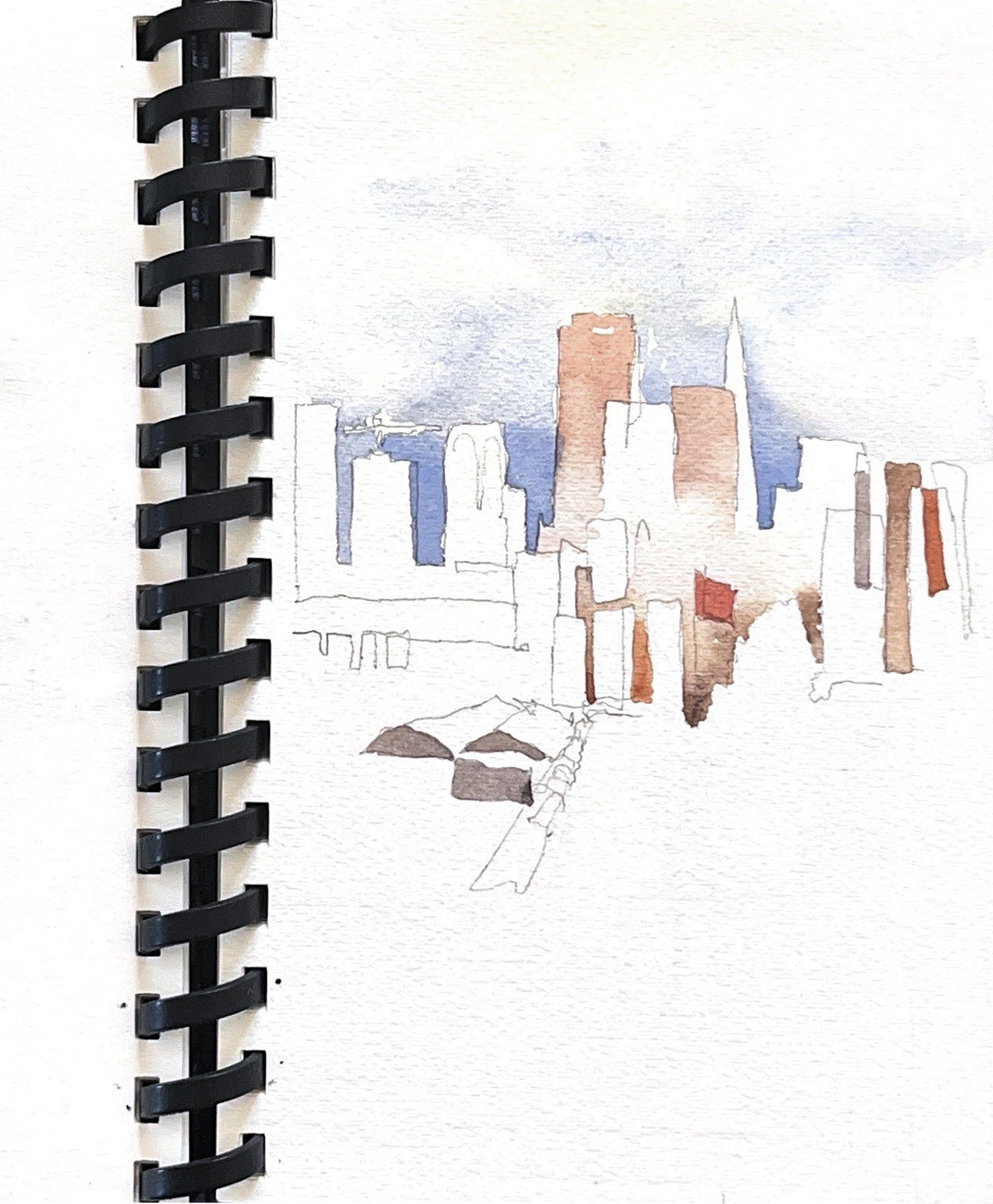
In direct contrast to these shapes here in SF is the waterfront. Ships and boats take on a completely different set of geometries:
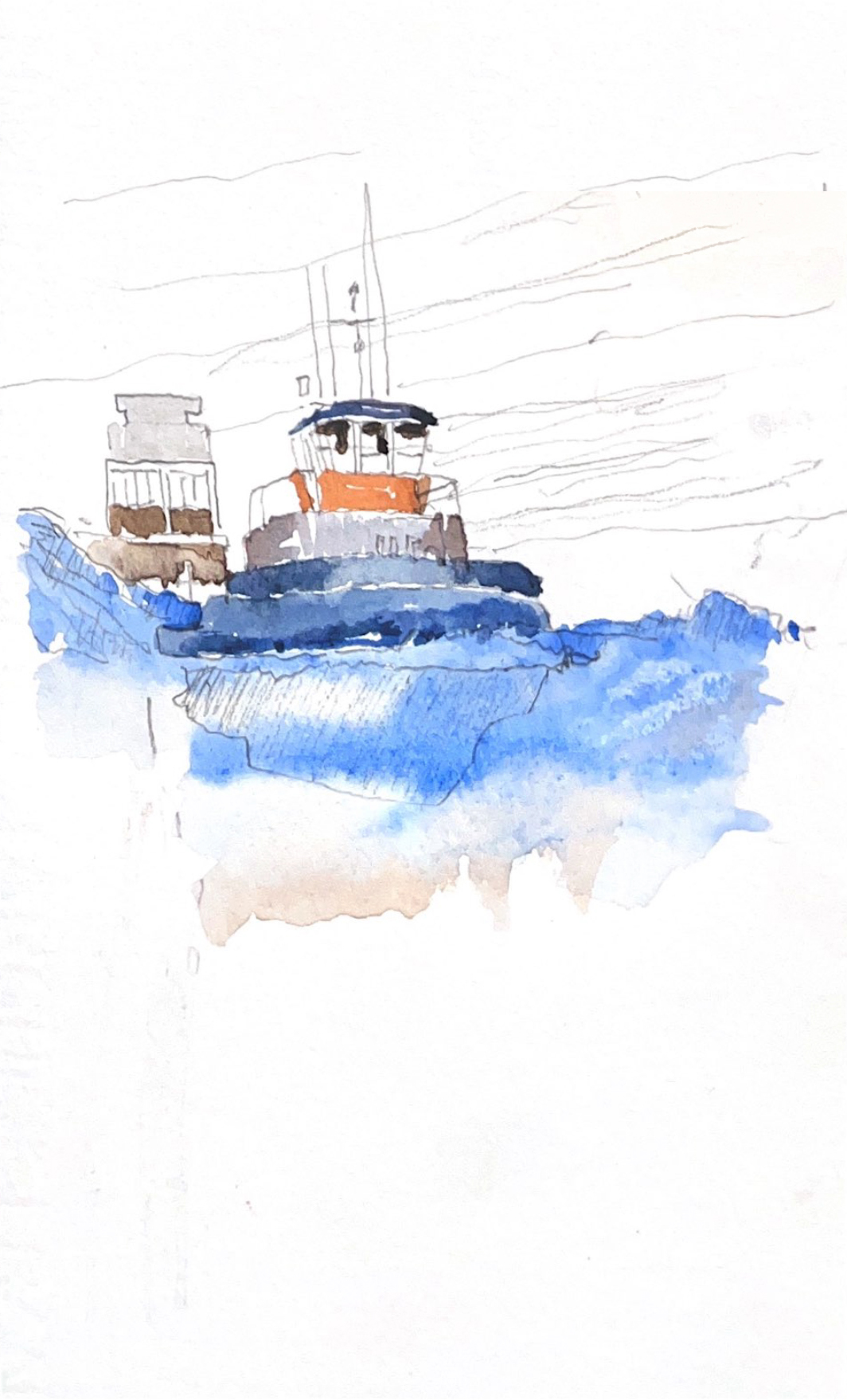
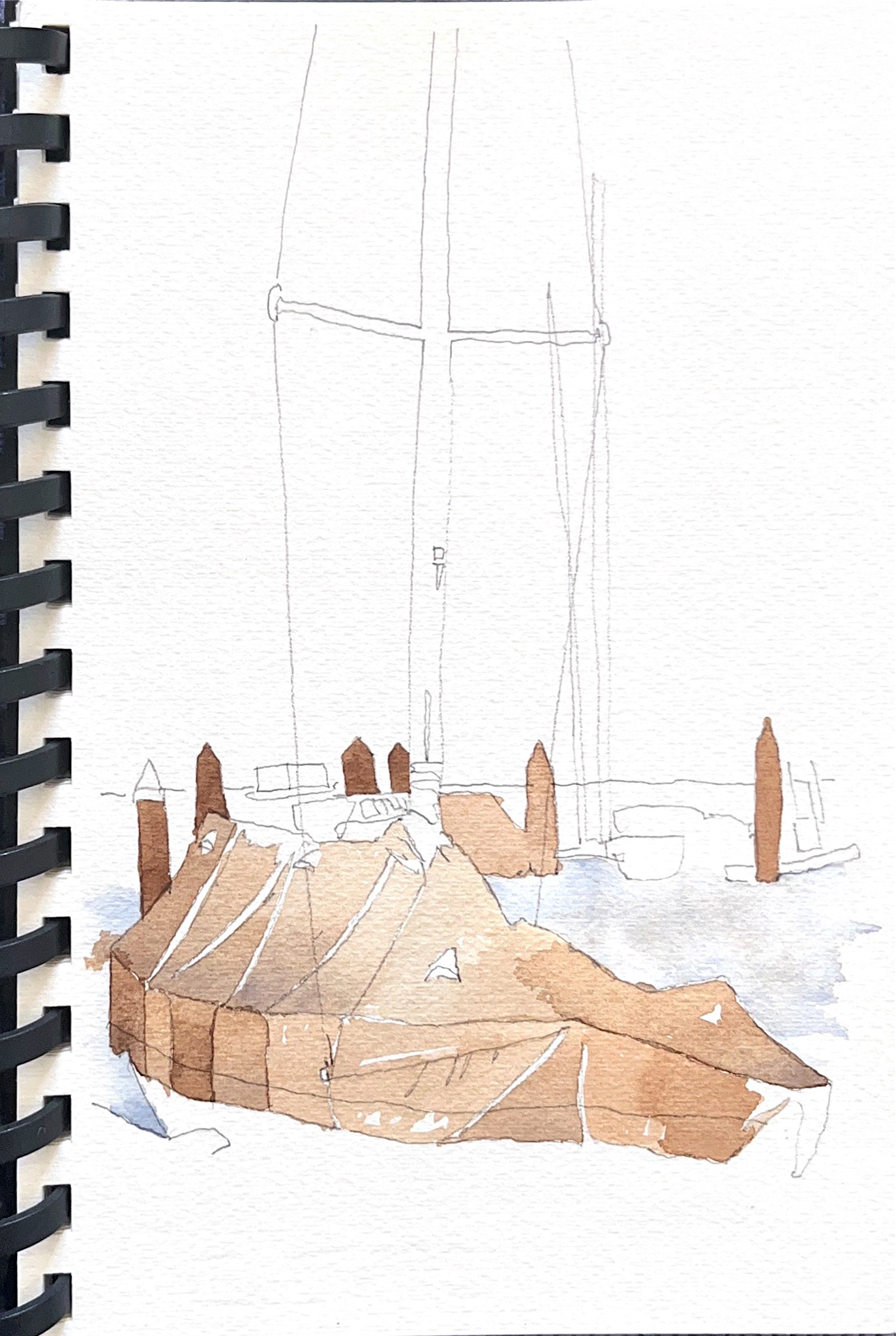
The watercolor sketches above are from my sketchbook, but Paige Ferguson-Tritt has done the following illustration of probably the most iconic tower in San Francisco:
.jpg)
I realize all of this is pretty basic stuff, but the controversy over New York’s pencil towers got me thinking about going back to how we see things. These are ways I like to view what I see when I go around sketching. What I see.
More on SHAPES: A good book is Colin Rowe’s Mathematics of the Ideal Villa.
Blog post written by Senior Architect, David Tritt.